
AVA Group Rebranding
Complete Visual Identity for Artificial Vision Applications

Overview
A full rebranding of the Artificial Vision Applications (AVA) research group at the University of Córdoba, covering a new visual identity and a redesigned website to present the group's research to the public.
I presented it as a formal brand proposal deck to the group rather than a finished, drop-in identity. Below is that deck's actual chapter order, the steps I walked the group through, from what the mark needed to say down to how it's meant to be applied.
The Steps
Introduction & Values
I opened the deck with the question every rebrand has to answer before anything else: keep the AVA acronym or move away from it, and which values the mark should actually carry (technology, innovation, vision, and computation), plus whether this was the group's first real identity or a rebrand of an existing one.
Basic Symbology
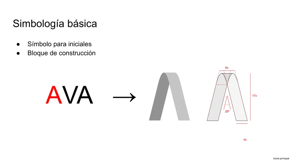
The starting point was the group's own initials. I folded three ribbon shapes into the letters A-V-A, then formalized that shape into a repeatable construction block (a fixed 6-unit-wide, 17-unit-tall module folded at a 28° angle) so the mark redraws identically at any size, from a favicon to a banner.
Secondary Icon
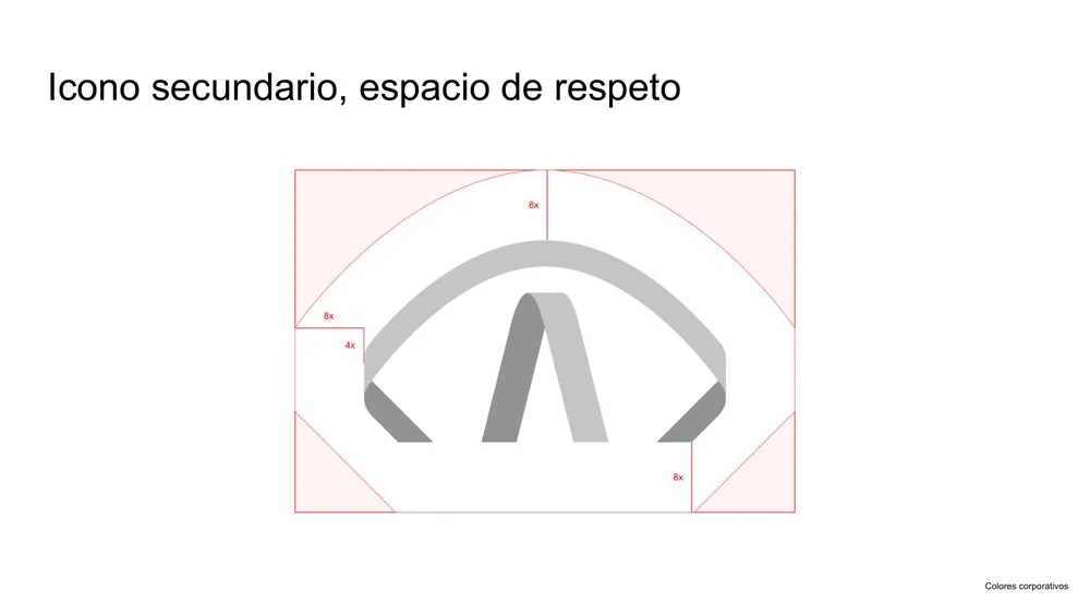
For tighter spaces (social avatars, favicons) I designed a secondary mark: an eye-shaped arc wrapping a simplified version of the same ribbon block, a direct nod to "Vision" with its own clear-space rules.
Color System
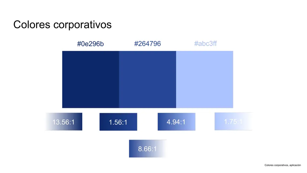
Two navy blues (#0e296b, #264796) and a light accent blue (#abc3ff) on white, chosen and contrast-checked for legibility (up to 13.56:1) so the palette holds up in both light and reversed, knockout-on-navy applications.
Typography
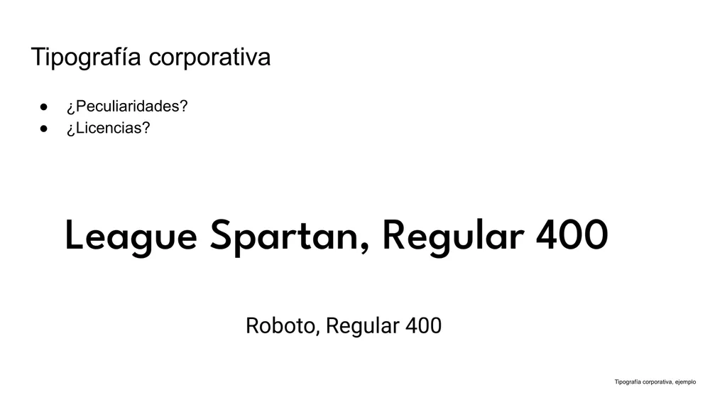
League Spartan carries the wordmark and headings; Roboto handles body copy: a geometric display face paired with a neutral workhorse, so the identity stays legible at both banner and paragraph scale.
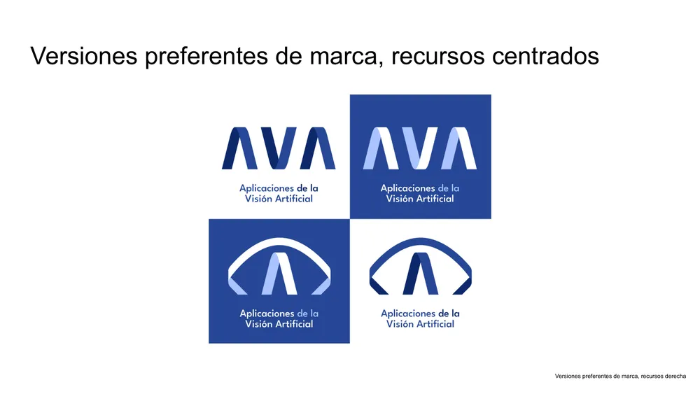
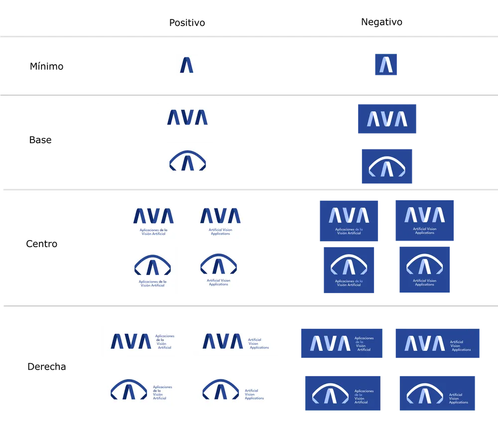
Preferred Lockups
Finally, I locked down how the icon and wordmark combine (icon above wordmark, icon beside wordmark), repeated across the full palette, including reversed versions for use on navy backgrounds.
Research Poster Templates
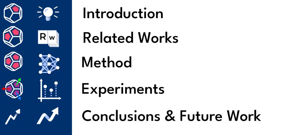
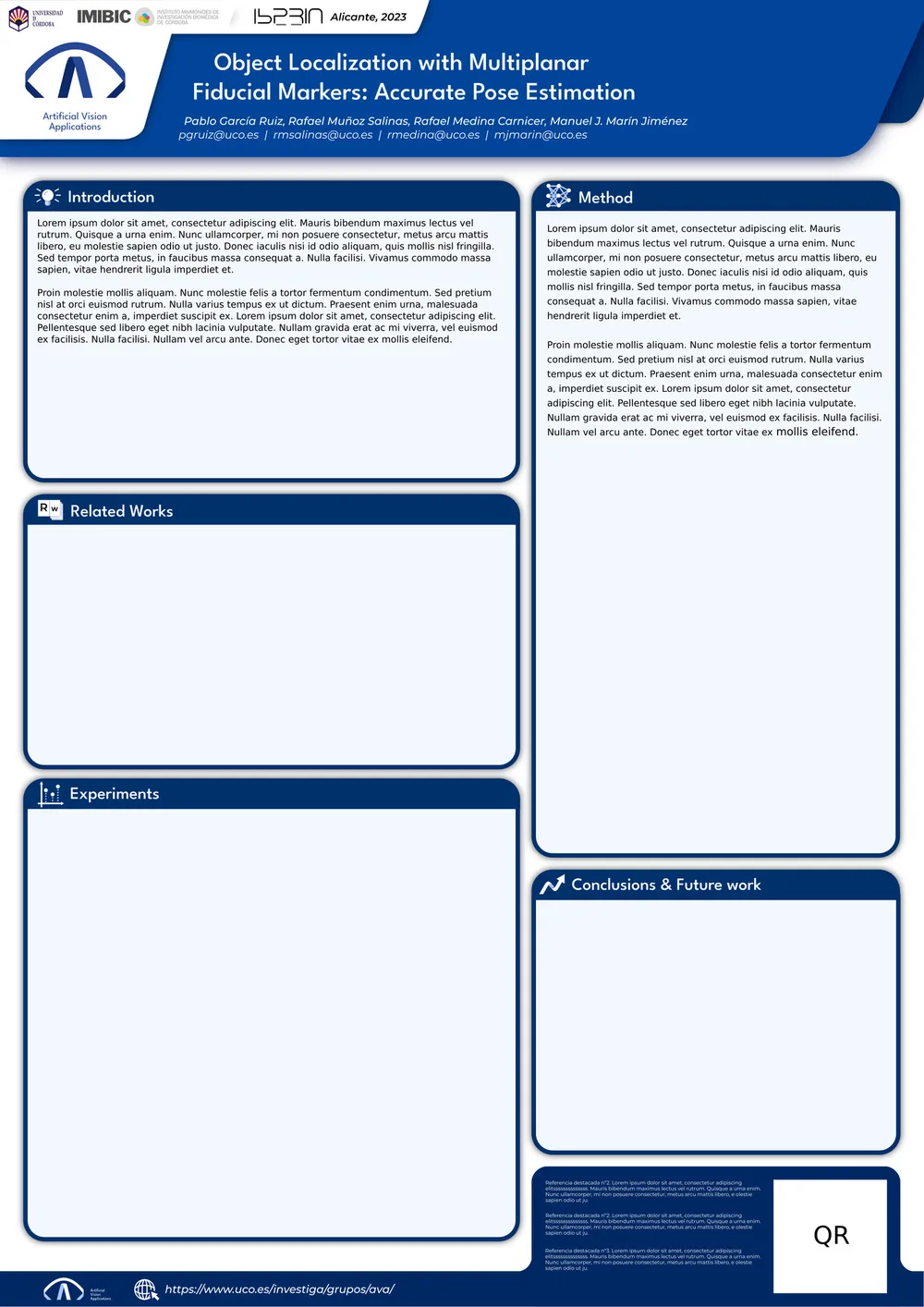
Following through on the rollout plan, I extended the identity into a matching icon set (isotype variations plus outlined glyphs for the standard poster sections) and used it to build a full research poster template, so any group member can drop their own content into a ready branded layout.
How to Move Forward
The deck closed with a rollout plan rather than a finished mandate: review the core resources, implement the identity using the preferred versions, roll it out everywhere it's needed, rebuild the site around it, generate templates for different areas of the group's work, and, eventually, grow it into a fuller brand universe.
Open Questions
The deck was built as a proposal, not a finished spec, several calls were left open on purpose, for the group to weigh in on before anything got locked down:
- Keep the AVA acronym, or move toward a new name entirely?
- Is this the group's first real identity, or a rebrand of an existing one?
- Should the palette fold in values from specific research fields, or stay general?
- Any restrictions on when the secondary (eye) icon can be used on its own?
- Any licensing considerations for the chosen typefaces?
Visit the Site
See the identity in context on the AVA group's homepage.
uco.es/investiga/grupos/ava